Bar Chart Race Maker
Make a bar chart race that animates rankings over time. Paste your periods, watch bars grow and overtake each other, then export HD video right in your browser. No install.


Bar Chart Race Maker Features
EchoWave's chart video tools are used by data journalists, marketers, and analysts worldwide.





Animated rankings
Turn a time series into a bar chart race
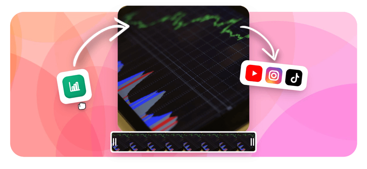
A bar chart race maker animates how a ranking changes over time, with bars that grow, shrink, and overtake each other as the data moves from one period to the next. Lay your periods across the columns of the data grid, paste them from Excel or Google Sheets, and EchoWave interpolates the values and positions between periods so the motion is smooth instead of jumping. The pacing adapts to the length of your clip, and you can limit the field to the top rows so a busy dataset stays readable. This is the race format from the wider chart video maker; for a static ranking, the animated bar chart maker draws a single frame of bars instead.
-
Smooth
values and ranks interpolate between periods
-
Top-N
show only the leading rows
-
Auto
pacing follows your clip length
-
Free
HD export, no software to install
What you get
Everything a bar chart race needs
Load a time series, animate the overtakes, and style the race to match your channel.
-
Smooth overtake animation
Values and rankings interpolate between periods, so a bar slides past its rival in a fluid motion instead of a hard jump. The gap closes and the order swaps exactly as the numbers cross over.
-
Period-by-period playback
Each column in your data grid is a time period, whether that is a year, a quarter, or a day. The race steps through the periods in order, redrawing the standings as it goes.
-
Pacing follows clip length
Set how long the segment runs and the race fits itself to that duration. A longer clip plays the periods out at a slower, more readable speed, while a short clip tightens the whole run.
-
Top-N ranking
Limit the race to the leading rows so a table with dozens of entries stays legible. Rows drop in and out of the visible field as they climb into or fall out of the top positions.
-
Paste your time series
Type values into the spreadsheet-style grid, paste a table from Excel or Google Sheets as TSV or CSV, or upload a CSV file. Transpose the table if your periods are down the rows instead of across the columns.
-
Count-up value labels
Each bar carries a number label that counts up and down as its value changes, so viewers can read the exact figure behind every overtake, not just the length of the bar.
-
Themes and colorblind palettes
Give each row a custom color, or apply one of 12 themes and 8 curated palettes checked with a color-vision-deficiency validator so the leaders stay distinct for colorblind viewers.
-
A real timeline segment
The race is a layer in the editor, so you can drop it over footage, resize and position it, trim its duration, and combine it with text, music, and subtitles.
How it works
How to make a bar chart race
From a time series to a finished race takes four steps, all in your browser.
-
Lay out your periods
Open the chart tool and put your categories down the rows and your time periods across the columns. Type them in, paste from Excel or Google Sheets, or upload a CSV file.
-
Pick the bar chart race
Choose the bar chart race chart type. The preview animates straight away so you can see the bars grow and swap order as the periods advance.
-
Style it and set the pace
Apply a theme and palette, set per-row colors, choose how many bars stay on screen, and set the segment length so the pacing matches your clip.
-
Add it to your video and export
Drop the race onto the timeline, layer it over any background, and export HD video in the browser. What you previewed is exactly what renders.
Who uses it
Who makes bar chart races
-
Data journalists
Show how league tables, populations, or market shares shift across decades in a short, watchable ranking video.
-
Marketing and brand teams
Race brand or product share over quarters to make a growth story land in a pitch deck or social clip.
-
Sports and gaming channels
Animate standings, all-time scorers, or player rankings across seasons for a recap that keeps viewers watching.
-
Finance and analysts
Chart top holdings, revenue by segment, or country GDP over time so the leaders and the overtakes read at a glance.
-
Creators and YouTubers
Turn a spreadsheet of stats into an explainer segment, then sync the race to a music track.
-
Sales and ops
Race rep leaderboards or regional numbers across months for a monthly recap shared as a short video.
Make your bar chart race
Open the editor, paste your time series, and animate the overtakes in minutes. HD export is free, right in your browser, with no software to install.
How creators use EchoWave in real projects

About the EchoWave team
EchoWave is a browser-based video and audio editor built by Lemon Vault LLC since 2018. The people who build the editor write these guides and test every step in the production app before publishing.
Bar Chart Race Maker FAQ
How do I make a bar chart race?
Open EchoWave's chart tool and lay your categories down the rows with your time periods across the columns, either by typing them, pasting a table from Excel or Google Sheets, or uploading a CSV file. Pick the bar chart race chart type, apply a theme and palette, set how many bars stay visible, and choose the segment length so the pacing fits your clip. Drop the race onto the timeline, layer it over any background, and export HD video in your browser. What you see in the preview is exactly what renders.
What data do I need for a bar chart race?
You need one row per thing being ranked and one column per time period, so each category has a value at every step. For example, countries down the rows and years across the columns. EchoWave reads that table and animates the ranking from the first period to the last. You can paste it from a spreadsheet or upload a CSV, and transpose it if your periods are down the rows instead.
How does the overtake animation work?
Between each pair of periods, EchoWave interpolates both the value and the position of every bar, so a bar that passes another grows and slides up the order in a continuous motion rather than snapping to its new place. That smooth crossover is what makes a bar chart race readable, because your eye can follow a single row as it climbs or falls through the standings.
Can I control the speed of the race?
Yes. The pacing follows the length of the segment on your timeline, so making the clip longer slows the race down and makes each period easier to read, while a shorter clip tightens the whole run. You set the duration and trim the segment like any other clip, and the race redistributes its periods to fit.
How many bars can I show at once?
You can limit the race to the top rows so a large dataset stays legible, and rows enter or leave the visible field as they climb into or fall out of those top positions. Showing a smaller set keeps the labels readable and puts the focus on the leaders and the overtakes rather than a crowded frame.
Can I put the bar chart race over a video?
Yes. The race is a real timeline segment, not a flat export, so you can layer it over your footage, resize and position it in the frame, and trim how long it runs. Set the chart background to transparent and the bars sit directly over your video, and you can add text, music, and subtitles in the same project.
Will the exported race match the preview?
Yes. EchoWave runs the same rendering engine in the browser preview and on the render servers, so the timing of every overtake, the fonts, and the colors you see while editing are exactly what comes out of the export. There is no second render path that could shift the animation, so you can trust the preview.
Is the bar chart race maker free?
Yes, you can build and preview a bar chart race for free with EchoWave's standard plans, right in your browser with no software to install. Free exports include a small EchoWave watermark, which upgrading to a paid plan removes. There is no credit card needed to start, so you can try the format before you decide.
Ready to race your data?
EchoWave is free to use in your browser, HD export included, with a small removable watermark on the free plan.
Get Started →